
All about our logo
- The sculptor
- Jan 28, 2022
- 2 min read
As a part of the rebranding we decided it was also time to have a new logo to represent our brand now as it’s progressed and to show where we’d like to be in the future. We worked together with our newest team member to create the logo we have now which we absolutely love. However it did take us quite a while to find a logo that we did like. We thought that it might be cool for you lovely people to see our creative process which will be found below.
Our first idea was to use an owl as We both have a love for owls and we think that they are symbolic of a really beautiful message of wisdom, regal silence, and fierce intelligence, not to mention their sleeping habits which we relate to. Below are some of the logo options we had designed that included owls.


We weren’t falling in love with any of the owl options as we felt they didn’t really represent us or our work. We then went on a trip to London to look at the museums and found a beautiful sculpture of a skull and a book which was part of a much bigger sculpture in V&A but it really stuck out to us as it resonated so much more. The archivist is and always has been a book worm. The sculptor has studied skulls throughout their fine art studies and had developed a love for them. Below is the original sculpture we saw and the skull logos we designed but didn’t connect with.


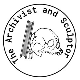


Finally we came up with the logo we have today, inspired by a picture that the sculptor saw and then roughly sketched out (picture below) which our newest team member then drew up and we knew it was the perfect new logo. After some tweaking, which you can see in the time lapse video below, we thought it was perfect.


Comments